Skip to content
User Guide
Search
K
Main Navigation
Home
Support
Acquia
Appearance
Menu
Return to top
On this page
Table of Contents for current page
Alert
Work in Progress
Intro
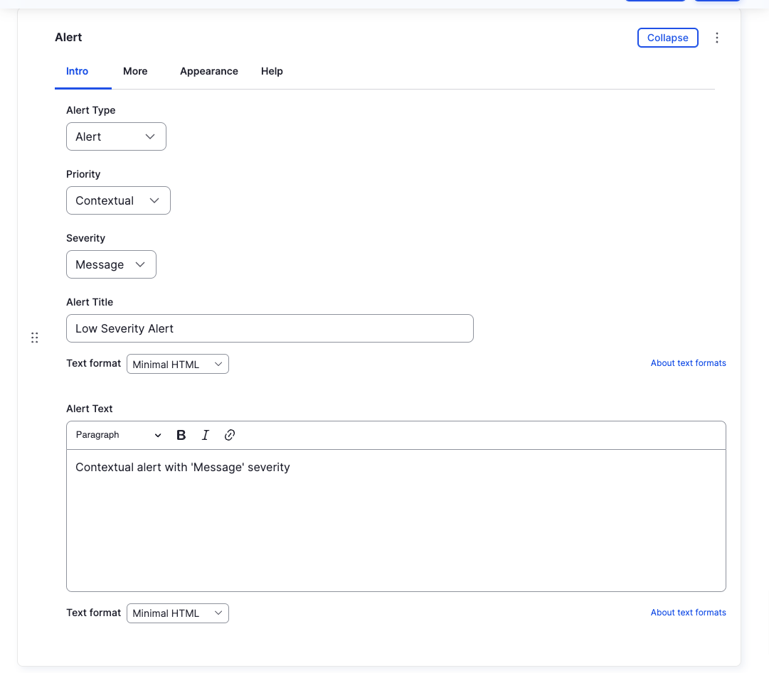
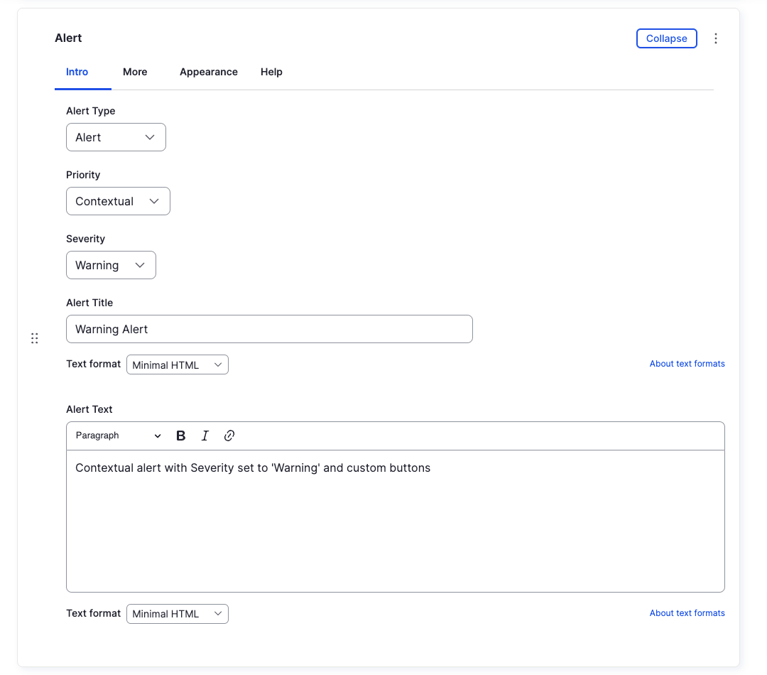
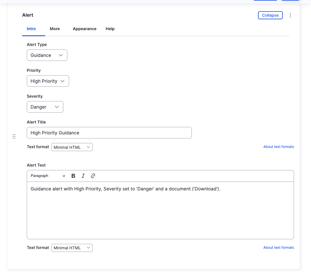
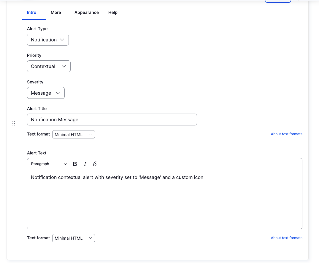
Alert Type
Priority
Severity
Alert Title
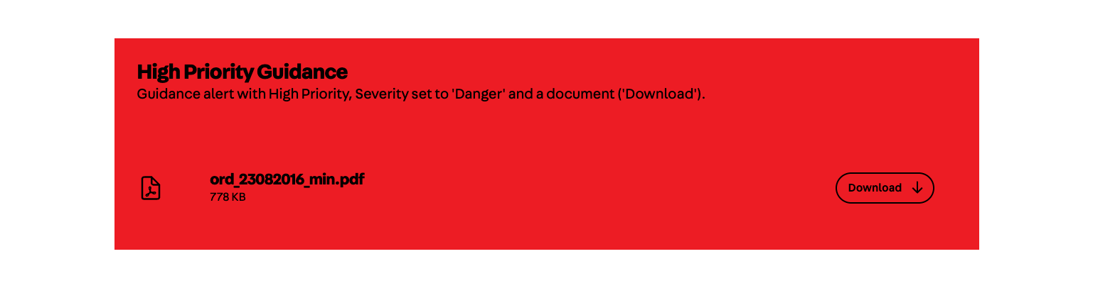
Alert Text
Backend
Frontend
More
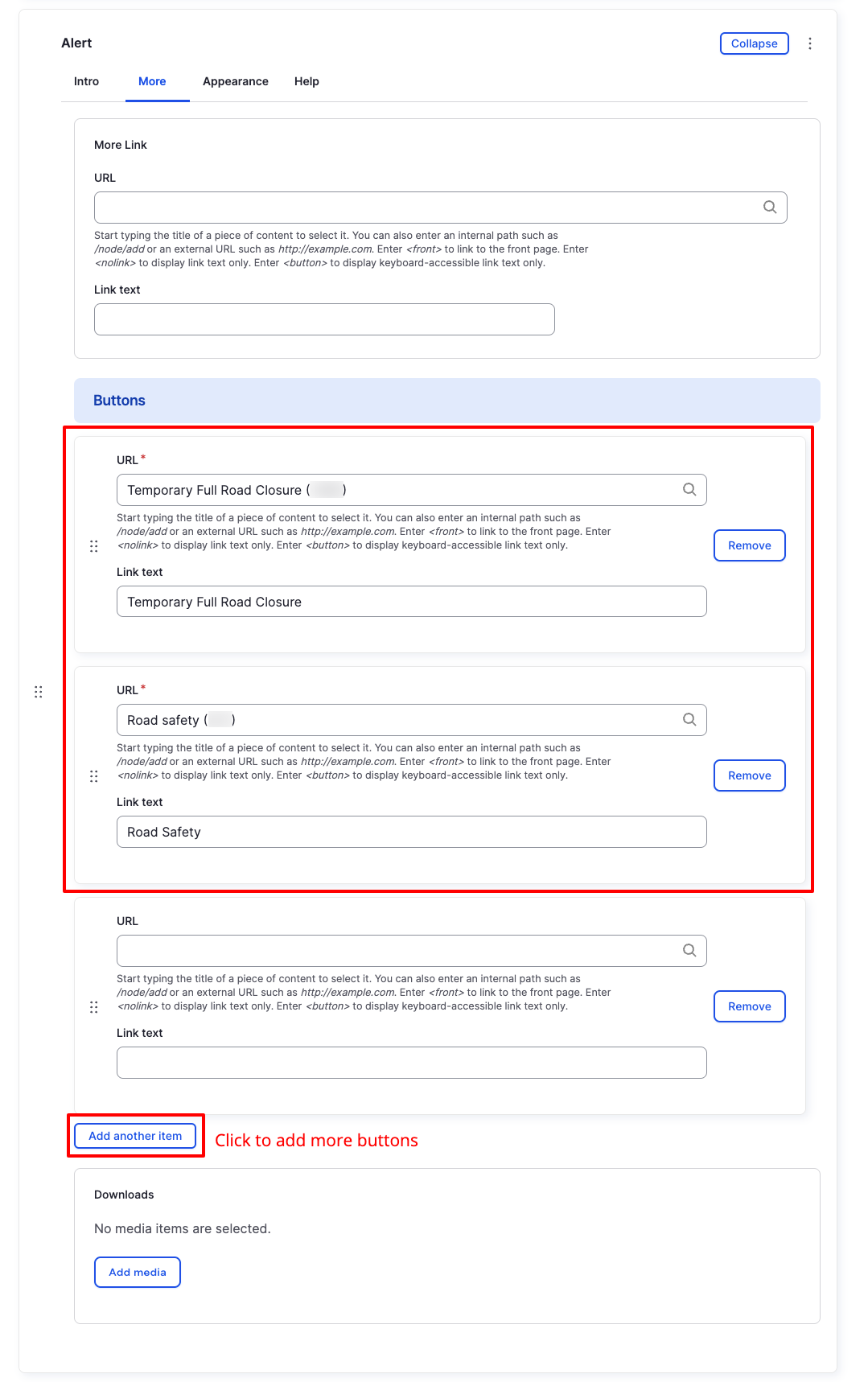
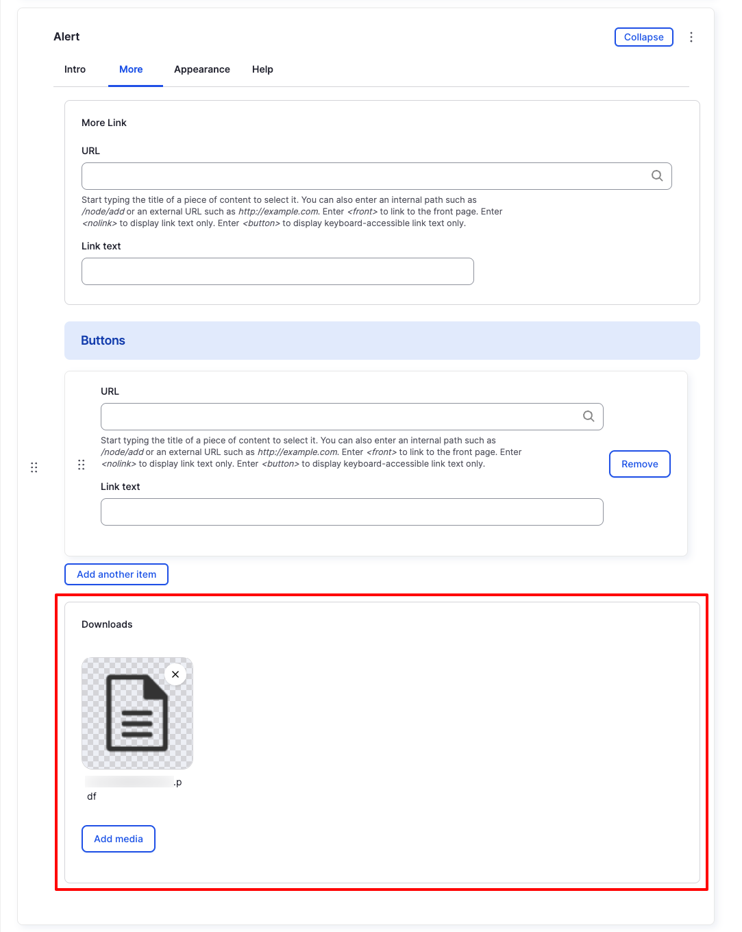
More Link
Buttons
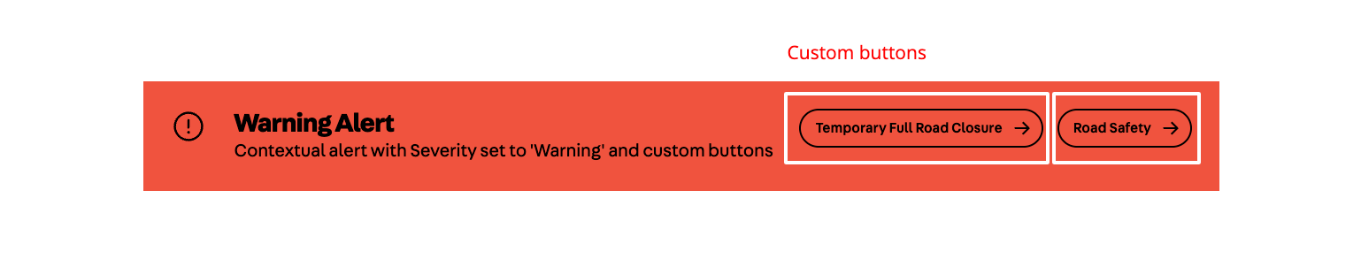
Backend
Frontend
Downloads
Backend
Frontend
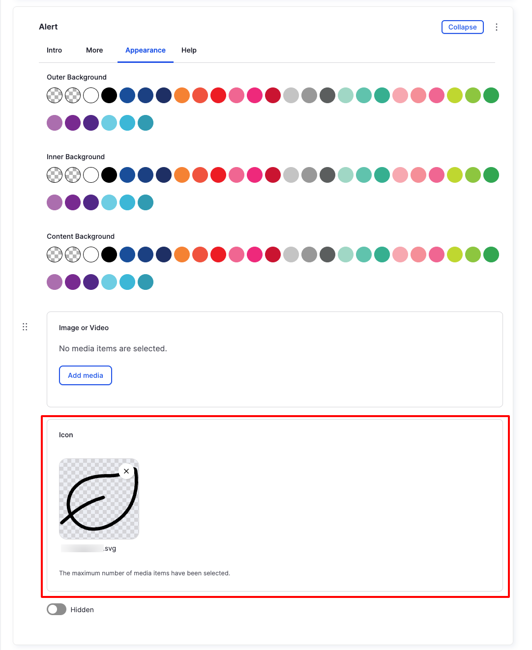
Appearance
Image or Video
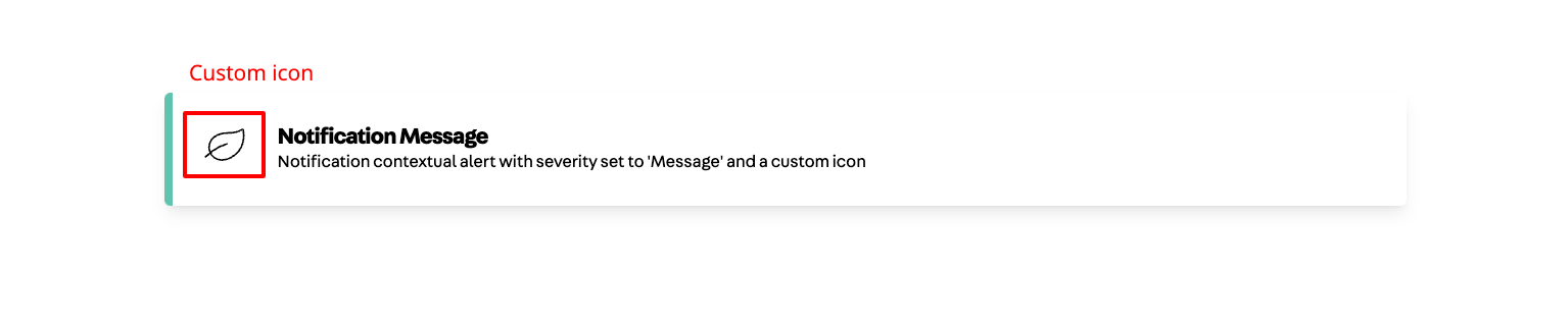
Icon
Backend
Frontend
